
Embracing simplicity
We’re bringing you a blog series filled with 5 design tips to help your business bloom. Missed some (or all) so far? Catch up here.
Part 4 is all about embracing simplicity: the power of minimalist design.
Less is more. In design, simplicity isn’t just about removing elements- it’s about refining them to communicate a message more effectively. A clean, well-structured design makes sure that your audience can quickly understand (and connect with) your brand’s message without unnecessary or confusing distractions.
Why simplicity matters
In a world overflowing and oversaturated with information, people appreciate clarity. We’re tired, and we want brands to get to the point without having to work for it. Overcomplicated designs can overwhelm and confuse, but a minimalist approach enhances readability, engagement and brand recognition. Think of Apple’s branding- its sleek, uncluttered aesthetic allows the product to shine, reinforcing its premium feel. Simple, but effective, and instantly recognisable.
Key ways to simplify your design
Prioritise “white space”: Allow elements to breathe by using a good amount of spacing. This improves readability and creates a sense of balance. (But when we say “white space” we really mean… space filled with your consistent brand colours. 😉)
Limit colour palette & fonts: Stick to a close-knit selection of colours and fonts that align with your brand identity, ensuring consistency. If you have a set of brand guidelines (either simple or cohesive), use them well! (If you don’t, consider setting some- or ask us to!)
Reduce visual clutter: Every element should serve a purpose- eliminate anything unnecessary. Prioritise which elements showcase your brand the best, and remember- less is more.
Focus on functionality: A simple design should still be functional. Whether it’s a website or printed materials, make sure your audience can navigate effortlessly, find the information they need and are signposted to more.
Use clear hierarchy: Arrange elements strategically so that the most important information stands out.
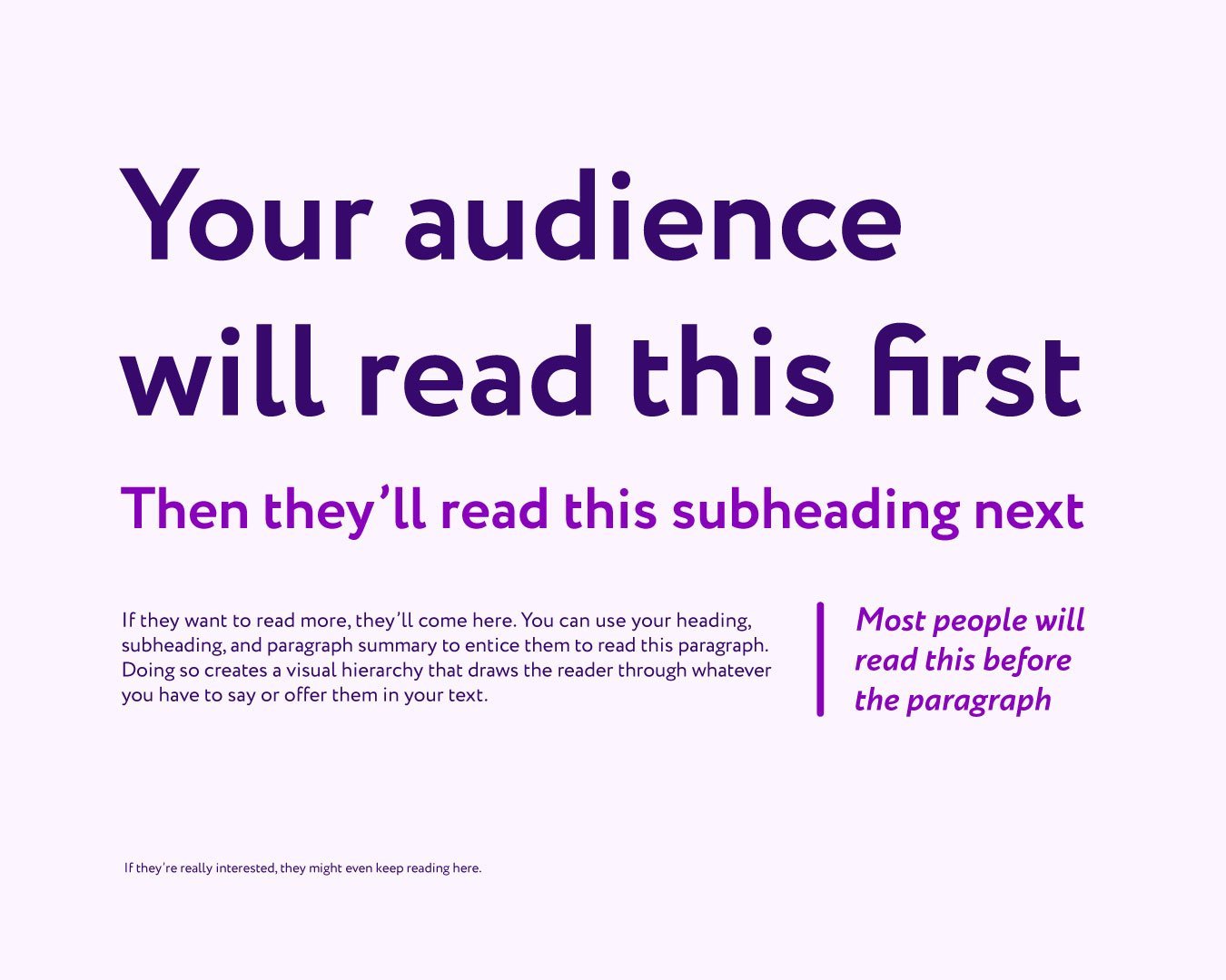
Here’s an example of using clear hierarchy! Find some more inspiration for making the important stuff stand out, on my blog post here.
How to implement simplicity
Test your design’s effectiveness: When you’re getting used to developing a simple but effective design, show your drafts to people you know and trust to see if they understand the message at a glance. And ask for feedback from your audience. Ask, listen and adapt.
Adopt a ‘quality over quantity’ approach: Every element should add value- if it doesn’t, reconsider if it’s necessary. You always want quality over quantity.
Be intentional with visuals: Avoid using excessive graphics or decorative elements that don’t support your brand’s message and don’t fit your brand’s identity or values.

Simplicity is timeless
Simplicity is timeless. A refined design enhances user experience, strengthens brand perception, and ensures your message is communicated effectively. By embracing minimalism, you will allow your brand to shine without unnecessary distractions.
Stay tuned for part 5 , where we’ll discuss how staying updated with design trends can keep your brand fresh and relevant.
We’re rooting for you
and your business to bloom 🌷
Need help simplifying your designs and brand? You don’t have to go it alone, we’d love to help you! Whether you need a rebrand, a brand refresh, templates, brand guidelines or something else, we’ve got you covered. Let’s chat: book in a no-obligation discovery call or drop us an email: hello@bloom-creative.co.uk. We can’t wait to help you make an impact with your visuals!
Bloom Creative is a design business based in Kent who support local and national businesses with a range of services that enhance their brand and get them seen and remembered, including: quality digital content, eye-catching print design, and bespoke branding & brand refreshes.
If you’re interested in our services and/or getting to know us better, you can book in a virtual coffee break call with founder Amy Walters.